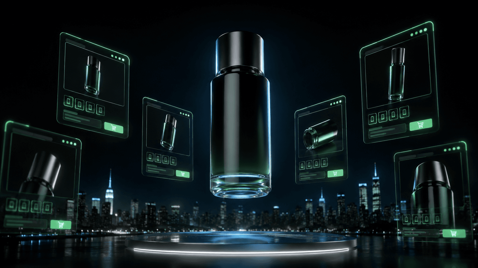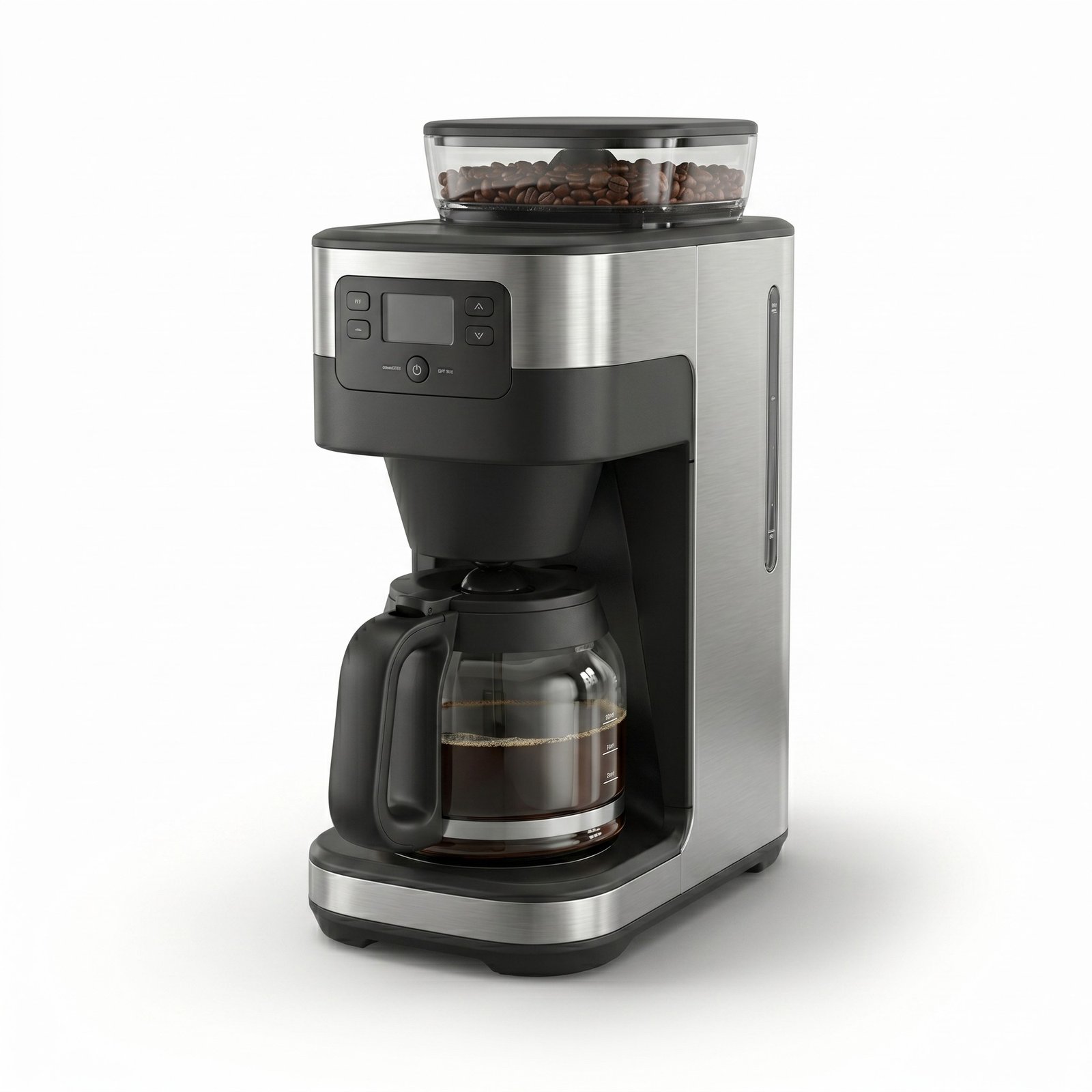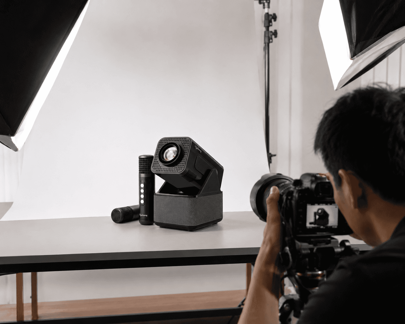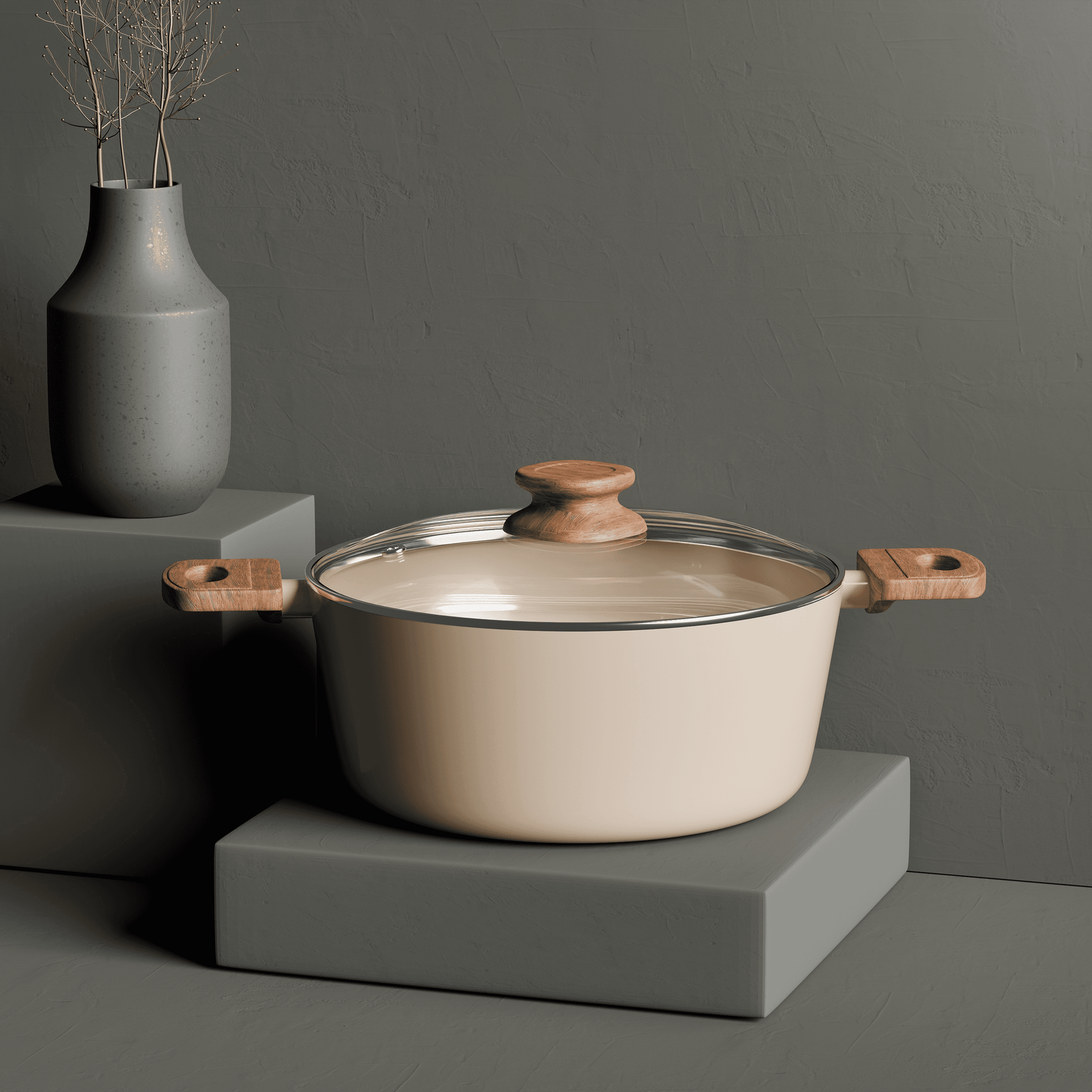
Product images are the first thing a shopper judges, and they judge them in about two seconds, before reading the title, the bullets or the reviews. 90% of shoppers name image quality as a top purchase factor, and 22% of returns happen because the product did not match the images. Bad images cost sales twice: once at the click, once at the return.
The number that keeps getting quoted
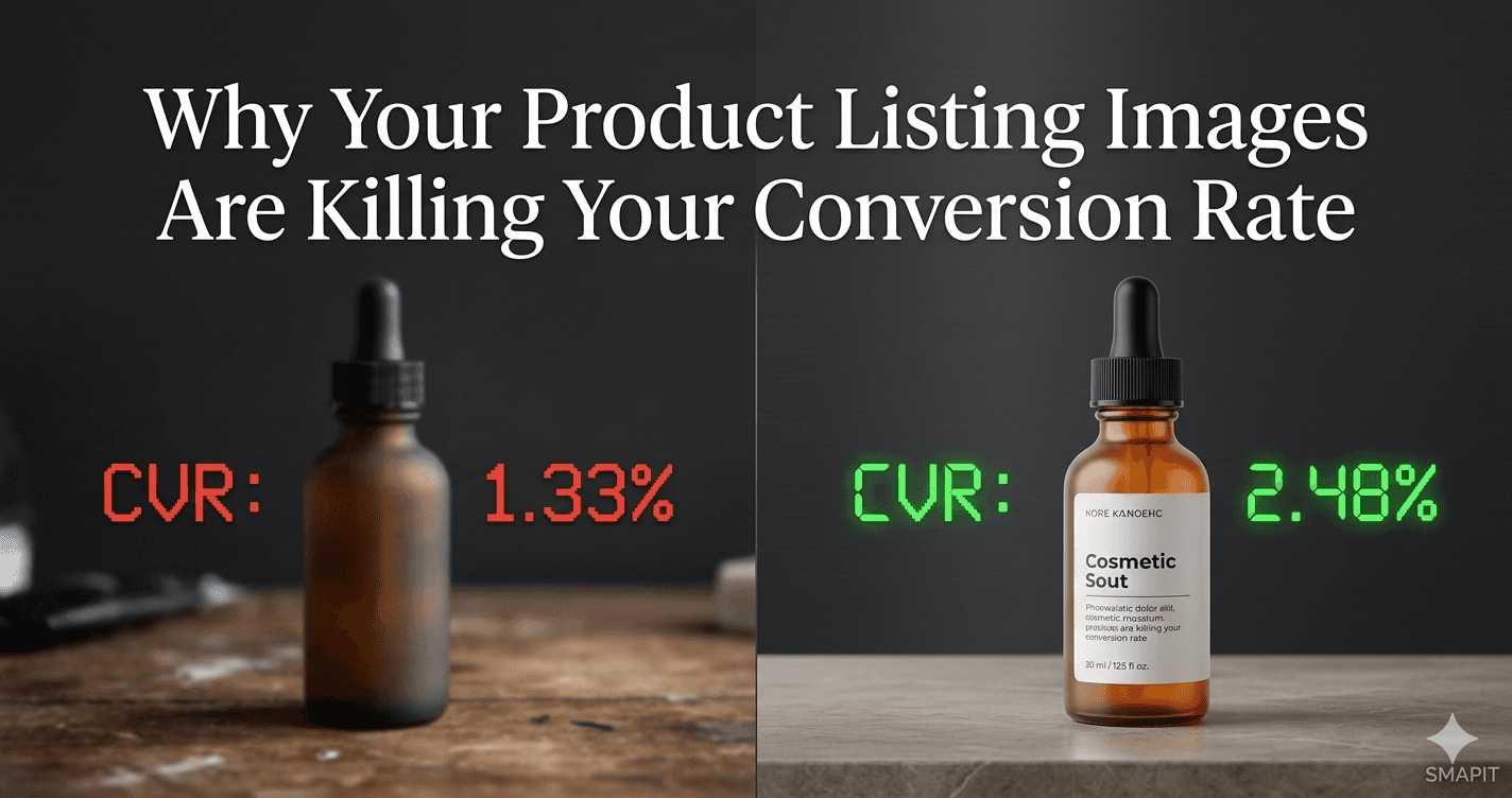
High-resolution imagery converts up to 33% higher than low-resolution imagery on the same listing. ASOS lifted conversion from 1.33% to 2.48%, an 86% improvement, after upgrading product image quality. A separate test showed a 63% conversion lift from making product images 28% larger. The pattern across studies is the same direction, and the same size of effect.
1. Resolution below 1,000 pixels
Zoom breaks, or turns to mush, below about 1,000 pixels. To a buyer, that reads as either a cheap product or a seller who does not care. Fix: 1,000x1,000 px minimum, 2,000x2,000 px as the working standard for anything that will ever be zoomed.
2. Only two or three images
60% of shoppers want three to four images before they will buy, and 13% want five or more. Listings that use only two or three images are leaving the customer with unanswered questions and hoping the reviews cover the rest. Fix: use every slot the marketplace gives you. Amazon allows nine.
3. Six near-identical angles
A rotated front shot, a rotated back shot and four more slight rotations teach the buyer nothing after image two. Fix: consolidate the duplicates and use the freed slots for content that actually answers a question, an infographic, a lifestyle shot, a dimensions image, a close-up of a material, a variant, the packaging.
4. No lifestyle context
A white background answers 'what is this'. A lifestyle image answers 'what does this do in my life'. That second question is the one blocking the purchase for furniture, home goods, apparel and beauty. Fix: at least one in-use image in a room, on a person or on a counter the buyer recognises.
5. No sense of scale
42% of shoppers rely on images to judge product size. A tape measure, a hand, a familiar object in the frame, or an annotated dimensions image will each prevent the return where the buyer says 'it was smaller than I thought'.
6. A weak main image
The main image is the only one a buyer sees in the search grid. It decides whether the listing is even clicked. Fix: professional lighting, zoomable resolution, 85% product fill, clean background, and it has to read sharply at thumbnail size on a phone. Every other image is a tie-breaker for a click this one has to win first.
7. Inconsistent style across the catalogue
Mixed lighting, mismatched backgrounds, drifting crops and different colour grades across a brand's SKUs read as amateur, whether or not the buyer can articulate why. Fix: a documented visual standard applied to every product in the range.
Why CGI solves most of these in one production brief
A single 3D pipeline produces 4K-plus resolution, fills every slot with genuinely different image types, gives perfect white backgrounds, holds exact dimensions and enforces catalogue consistency by default. The reason it matters is not that CGI is trendier than photography. It is that these seven mistakes are structural, and CGI removes the structural cause of each one.
What the numbers imply for a normal store
The global ecommerce conversion average sits at 2-3%. Well-optimised listings run at 4-5%+. Half of the gap between those numbers is images. A brand that fixes all seven mistakes above is not chasing a marginal improvement; it is closing the distance between an average listing and a good one.
Where images matter less
Repeat-purchase consumables where the buyer already knows the product, and B2B listings where the specification sheet is doing the persuading, will see smaller image-driven lifts. Everywhere else, this is where the conversion budget belongs before anything else on the page.